ebotify
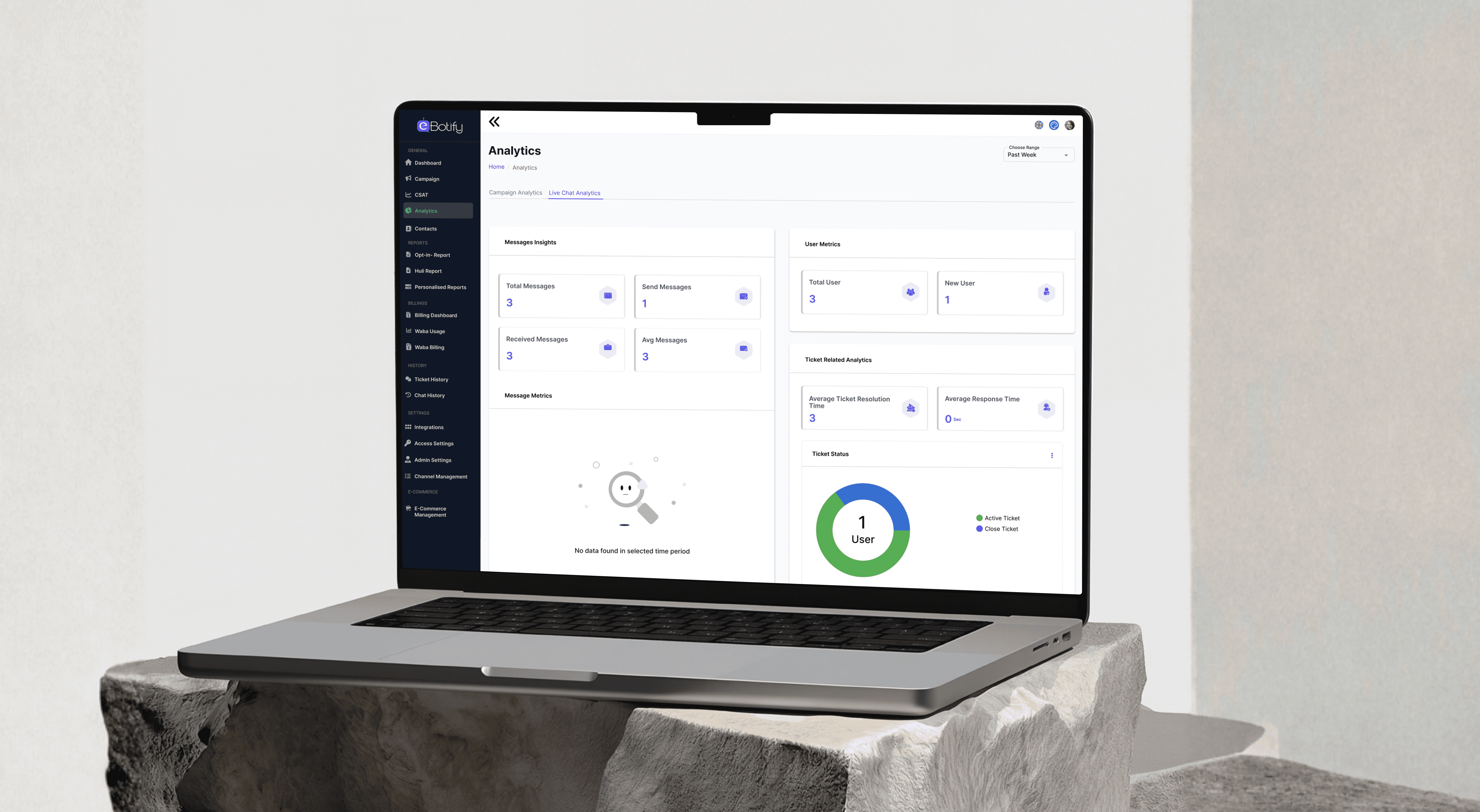
eBotify is an AI-powered chatbot platform that helps businesses automate customer interactions across WhatsApp, Facebook, Instagram, SMS, and web. I worked as a UX designer on the internal operator dashboard — the app business teams use daily to manage bots, campaigns, contacts, conversations, and e-commerce operations. My focus was translating complex product requirements into clear, consistent, and usable interfaces across 9+ modules of a live SaaS product.
eBotify is an AI-powered chatbot platform that helps businesses automate customer interactions across WhatsApp, Facebook, Instagram, SMS, and web. I worked as a UX designer on the internal operator dashboard — the app business teams use daily to manage bots, campaigns, contacts, conversations, and e-commerce operations. My focus was translating complex product requirements into clear, consistent, and usable interfaces across 9+ modules of a live SaaS product.
eBotify is an AI-powered chatbot platform that helps businesses automate customer interactions across WhatsApp, Facebook, Instagram, SMS, and web. I worked as a UX designer on the internal operator dashboard — the app business teams use daily to manage bots, campaigns, contacts, conversations, and e-commerce operations. My focus was translating complex product requirements into clear, consistent, and usable interfaces across 9+ modules of a live SaaS product.
Ebotify
Challenge
The eBotify operator dashboard serves users with very different
mental models — a small business owner setting up their first
WhatsApp campaign operates very differently from a support agent monitoring live conversations.
The dashboard had 9+ modules with inconsistent UI patterns across list views, forms, and modals — creating a disjointed experience
Data-heavy screens like Contacts, Visitors, and Orders lacked clear hierarchy,making it hard to scan and act quickly
Multi-step flows like Campaign creation and Bot Builder had no clear progress indication, leaving users uncertain about where they were in the process
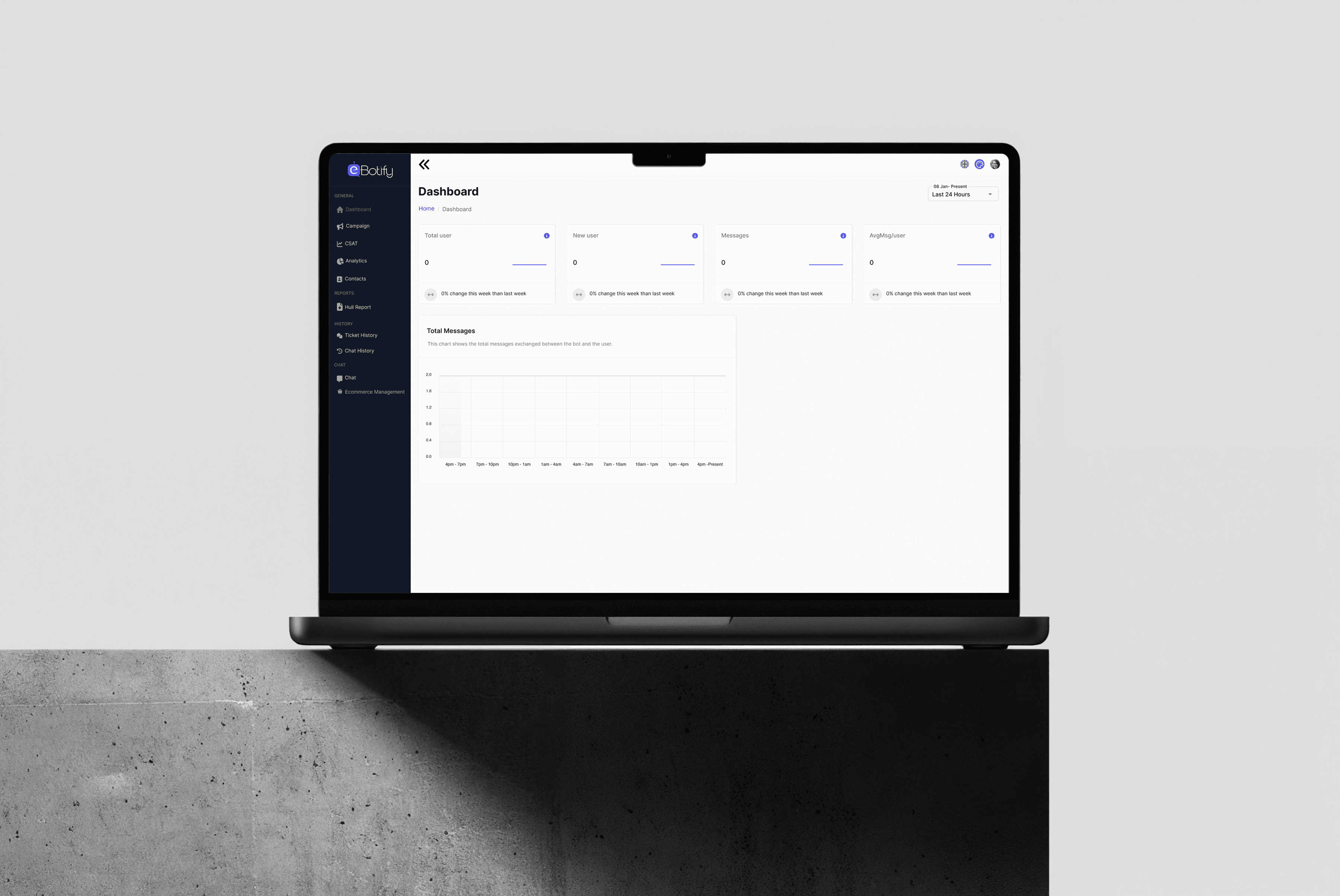
Empty states were unhandled — new users landed on a blank dashboard with no guidance on what to do next
The navigation had 15+ items visible at once, overwhelming users who were new to the platform
The eBotify operator dashboard serves users with very different
mental models — a small business owner setting up their first
WhatsApp campaign operates very differently from a support agent monitoring live conversations.
The dashboard had 9+ modules with inconsistent UI patterns across list views, forms, and modals — creating a disjointed experience
Data-heavy screens like Contacts, Visitors, and Orders lacked clear hierarchy,making it hard to scan and act quickly
Multi-step flows like Campaign creation and Bot Builder had no clear progress indication, leaving users uncertain about where they were in the process
Empty states were unhandled — new users landed on a blank dashboard with no guidance on what to do next
The navigation had 15+ items visible at once, overwhelming users who were new to the platform
Solution
I focused on bringing consistency, clarity, and structure to a complex multi-module SaaS dashboard working within product-defined requirements while making design decisions that directly improved usability.
Standardised table components across all list views column spacing, action placement, and pagination so every module felt like one product
Designed clear empty states with illustrated visuals and next-action prompts, turning blank screens into guided starting points
Used status badges with consistent colour coding across Campaigns, Contacts, and Visitors so users could assess state at a glance
Applied a modal vs. full-page rule atomic tasks (≤4 fields) stay in modals; multi-step flows get dedicated pages reducing cognitive load
Designed the Conversations screen as a three-panel layout keeping the message input always visible so agents never had to scroll to reply
Kept the Visitor page toggle (Static vs. Live) prominent in the header to prevent agents from misreading which data mode they were viewing
I focused on bringing consistency, clarity, and structure to a complex multi-module SaaS dashboard working within product-defined requirements while making design decisions that directly improved usability.
Standardised table components across all list views column spacing, action placement, and pagination so every module felt like one product
Designed clear empty states with illustrated visuals and next-action prompts, turning blank screens into guided starting points
Used status badges with consistent colour coding across Campaigns, Contacts, and Visitors so users could assess state at a glance
Applied a modal vs. full-page rule atomic tasks (≤4 fields) stay in modals; multi-step flows get dedicated pages reducing cognitive load
Designed the Conversations screen as a three-panel layout keeping the message input always visible so agents never had to scroll to reply
Kept the Visitor page toggle (Static vs. Live) prominent in the header to prevent agents from misreading which data mode they were viewing
Impact
The design work contributed to a more cohesive and navigable
operator experience across a live, multi-module SaaS product.
Consistent component patterns reduced visual inconsistency across 9 modules
Empty state design ensured new users had a clear next step
rather than landing on a blank screenStructured modal/page hierarchy reduced task confusion
in high-frequency workflows like campaign creation and contact updatesThree-panel Conversations layout kept critical actions always accessible for support agents during live chat sessions
Visitor page mode toggle prevented a high-stakes data misread
that could cause agents to miss unassigned live visitors
The design work contributed to a more cohesive and navigable
operator experience across a live, multi-module SaaS product.
Consistent component patterns reduced visual inconsistency across 9 modules
Empty state design ensured new users had a clear next step
rather than landing on a blank screenStructured modal/page hierarchy reduced task confusion
in high-frequency workflows like campaign creation and contact updatesThree-panel Conversations layout kept critical actions always accessible for support agents during live chat sessions
Visitor page mode toggle prevented a high-stakes data misread
that could cause agents to miss unassigned live visitors


Deliverables
High-fidelity UI screens across 9+ dashboard modules
Component-consistent table and list view designs
Campaign creation and management flow
Live chat / Conversations interface
Bot Builder flow canvas and node editor screens
Visitor tracking page with static/live toggle
WhatsApp template management and channel configuration
Knowledge Base and FAQ management screens
E-Commerce orders and product catalog screens
Dashboard overview and analytics empty states
High-fidelity UI screens across 9+ dashboard modules
Component-consistent table and list view designs
Campaign creation and management flow
Live chat / Conversations interface
Bot Builder flow canvas and node editor screens
Visitor tracking page with static/live toggle
WhatsApp template management and channel configuration
Knowledge Base and FAQ management screens
E-Commerce orders and product catalog screens
Dashboard overview and analytics empty states
More work
More work
2019 - 2025
2019 - 2025
A showcase of digital products I’ve crafted for SaaS, FinTech, and startup teams.
A showcase of digital products I’ve crafted for SaaS, FinTech, and startup teams.




Contact
Let's Get in Touch
Let's connect and start with your project ASAP.
Or email 2222vishakha@gmail.com
Contact
Let's Get in Touch
Let's connect and start with your project ASAP.
Or email 2222vishakha@gmail.com
Contact
Let's Get in Touch
Let's connect and start with your project ASAP.
Or email 2222vishakha@gmail.com